TGI Fridays
Research and design sprint to radically improve mobile conversions for the Americana-themed restaurant chain
Activities
User Interviews
Ideation
Prototyping
Usability Testing
Conversion Rate Optimisation
Duration
8 weeks
Outcomes
200% increase in booking completions in the first month
Streamlined user journeys
Defined A/B tests to improve marketing conversion.


TGI Fridays is an Americana-themed restaurant chain. Historically known for post-work cocktails, the business had recently rebranded and sought to extend its appeal to casual diners and families.
An internal decision had been taken to a new platform, which presented an initial opportunity to update designs. Our UX Director led the multi-functional team.
Leading a junior colleague I joined as Senior UX Consultant to improve the performance of key landing pages and optimise the mobile booking experience. Others worked in parallel to develop a new visual treatment and design system.


A review of existing data and the current experience clarified what we needed to learn from users and how to structure the sessions.
Understanding user expectations and problems with the as-is booking flow
We started the project with a thorough review of the current booking flow to identify where the blockers were and who was having the most issues.
To ensure insights were relevant we interviewed a representative sample of users – diverse people who’d recently used their mobile device to book with similar chains. We found that:
Visual presentation and confusing promotions created a poor first impression.
Product availability and restaurant information were often inadequate, giving people cause to hesitate while browsing and booking.
Participants regularly use their mobiles to book for convenience and felt the website and booking flow compared poorly with expectations and experience of competitors.
Booking for groups and experiences was more complicated than expected, with unclear criteria such as card details required to secure group bookings.
Participants encountered problems amending and cancelling bookings, potentially an explanation for costly no-shows.
The research yielded 4-5 key themes and some 41 design recommendations giving us a really solid foundation to go into the design sprints with.
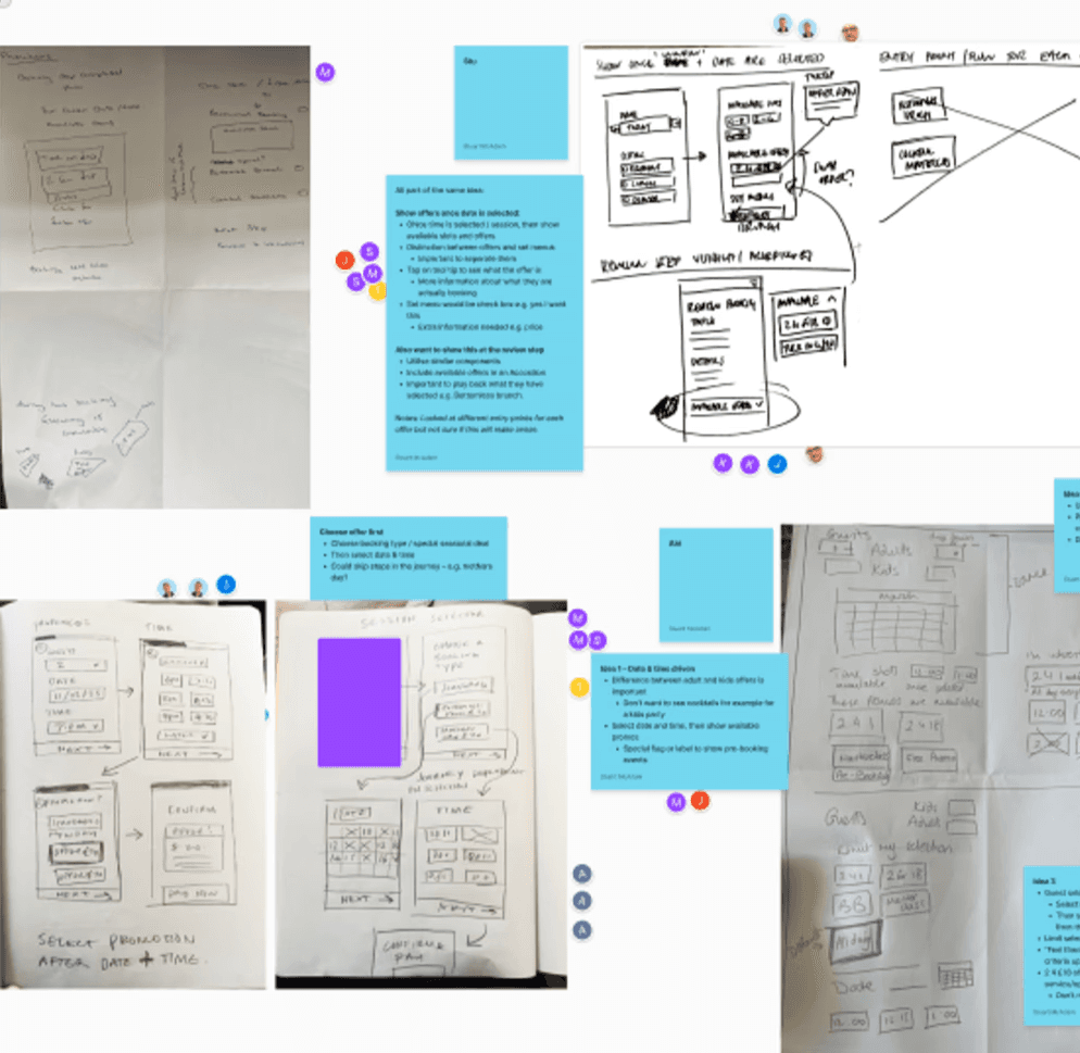

The Crazy-Eights ideation technique was an efficient way to collaboratively explore solutions with TGI Fridays stakeholders and other functions in the project team.
A fast-paced and productive design sprint to build on insights
Given the time and technical constraints we needed to maximise stakeholder expertise and ensure buy-in to the design of key moments in the journey. Splitting the ideation into two chunks enabled us to move forward with confidence.
Co-design with stakeholders accelerated problem solving
A cross-functional crazy 8s workshop enabled us collectively to explore divergent solutions, and align on 16 concepts to drive design
Working with my partner and the project Lead I used the same method to ideate on the remaining problems and redefine the new booking flows

A whiteboard was a useful way to visualise new flows and align on priorities for testing.
Regular check-ins to evolve the prototype in line with strategy
After ideation we were ready to jump into prototyping new flows, whilst having regular show-and-tells with the stakeholder team to ensure we were aligned:
Plotting screens in Figjam was an easy way to document the research objectives for usability testing and begin drafting a discussion guide.
I prototyped new features, scrolling frames and modals using mid-fidelity components drawn from the evolving design system.
As the new brand came to life it was then easy to increase the fidelity and simulate interactions. This ensured usability was evaluated using the most realistic stimulus possible.
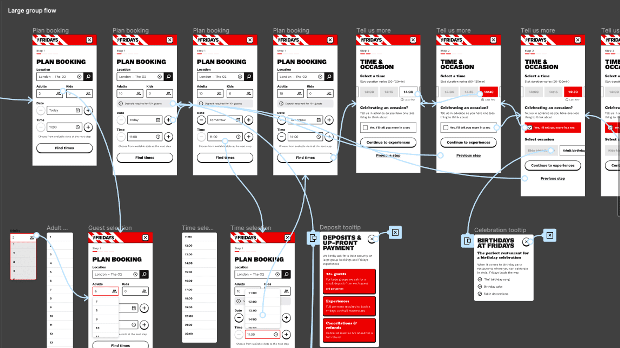
To create a highly interactive prototype of the new booking flows we updated wireframes using components from the new TGI Fridays design system.
Additional testing to refine the experience
Six typical users were recruited for one-to-one remote sessions. They responded positively to the new bold look and feel. The majority of tasks were completed quickly and intuitively, without the need for assistance.
Usability testing revealed three themes for further refinement:
We found that participants moved through news flow at pace and didn't always retain informational context from one screen to the next. We revised microcopy, tool tips and button labels to reduce uncertainty and increase users’ confidence to progress.
Use of red and black limited ability to indicate pre-selections and CTAs which caused participants to fail tasks. Complimentary colours were added and variants revised to improve the visibility of active states, information and required actions.
Add-ons and promotions within the booking flow still distracted users and caused confusion. Moving promotions later in the flow helped users focus on their goal and engage more positively once they’d booked.
Outcomes
Design changes informed by research led to a 200% increase in completed bookings in the first month, and an increase in returning visitors.
The success and additional recommendations helped secure a second phase of work, focused on personalisation initiatives such as account creation and loyalty benefits.
A retainer was agreed to help the digital marketing team pursue strategic objectives and investigate further opportunities to optimise conversion.
“The first phase of the redevelopment has been well received by customers. We're excited to progress together and make further enhancements to the site.”
Rhiannon Scarlett, CMO, TGI Fridays

Experiments with potential to reduce friction and increase conversion were prioritised using the ICE framework (expected Impact, Confidence and Effort).
CRO experiments to build on success
With 90% of bookings being made on mobile it was essential to build on the success of the mobile-first relaunch.
Analysis of high traffic pages would help stakeholders create a roadmap of strategic improvements. In collaboration with a content strategist colleague I reviewed page objectives and behavioural data and identified 50 hypotheses for A/B testing, such as:
Optimising content order, imagery, and messaging to prominently will showcase value propositions and drive engagement.
Drive conversion by removing an Offers carousel and reducing homepage clutter to highlight just one or two priority promotions on the page.
Showcasing delivery partners above the fold will raise awareness of credible delivery services and inspire engagement.